
Home Page is the face of a website. In this advanced era of smartphones and mobile devices, people don’t consider a website good if it doesn’t attract them. The chances are they immediately switch to the other if they find something else interesting than the previous one. What would you do if you are planning to design the home page for your business website?
At this moment, your sole objective is to create a highly interactive home page that can leave a lasting impression on users who come to your website. Doing this can bring traffic to your website and help your business attain a position of repute amongst competitors.
Table of Content
- How do you create an ideal home page?
- What are the best practices for designing an interactive home page?
- Follow the below design principles to create an ideal home page.
- Design according to your target audience.
- Design that keeps visitors engaged.
- Make it responsive.
- Don’t forget to include Call to action buttons.
- Keep up with the trends.
- Effective Design.
- Choose Appropriate Layout.
- Place Compelling Content.
- Primary Call to action.
- Use video or images video to portray your message.
- Conclusion
How do you create an ideal home page?
Homepage ideas are not all about having a perfect look and feel; it’s also the design and functionality that make it ideal. Therefore, the most brilliant home pages or the most famous ones are not just about the looks; it’s the way they perform.
Well, we are not going to discuss UX and UI design in web designing.
We will look at some of the best examples to help you make your website home page. But before that, let’s understand the best practices to create an ideal home page.
What are the best practices for designing an interactive home page?
As it is already mentioned, it’s not just about the look and feel, but it has a lot to do about your website homepage design or the whole website functions.
The perfect combination of user experience and great looks is what makes it an ideal website. But you have to choose the best practices to create an interactive website.
Some key factors contribute to the whole design and experience, which we are going to discuss.
Let’s start with the design itself.
Follow the below design principles to create an ideal home page
The design should clearly explain some questions about your website.
- Who are you?
- What do you do?
- What can the visitor do on the website?
If you are an established company, you don’t have to bother with these questions. However, some of the most reputed companies like Facebook and Coca-Cola still follow these basic principles.
Why do they follow these principles?
That’s because it helps people know that they are not on the wrong page.
If the visitor cannot identify if he is at the right place or not, he won’t stick around for long. This may be why many big brands still follow the basics even if they don’t need to.
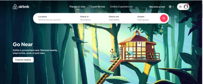
HomePage of Airbnb
Design according to your target audience
Targeting the audience can be done in many ways; design is one of them.
A homepage needs to be narrowly focused; it’s like speaking in their language.
You need to get rid of anything extra and focus on your target audience.
For example, some of the ecommerce websites must focus on all age groups, which means they should be neutral in design, not targeting anyone.
Design that keeps visitors engaged
When a visitor arrives at your homepage, it should stimulate them to navigate your website and choose you over your competition.
The homepage must fascinate users to stick around for long. A homepage is one of the best places to gain your market value proposition so the prospects can instantly choose to stay on your website. It reduces the chances of bounce rates and makes users not navigate to other competitive websites.
Make it responsive
Since there are more mobile devices like smartphones and tablets than desktops, it is essential to have your website responsive, which means you need to keep an eye on how it looks in a mobile view.
Some websites look amazing, but when it comes to the mobile view, they fail. So, check the design on both views.
![]()
HomePage of PixelGrade
Don’t forget to include Call to action buttons
Every homepage must be designed with primary and secondary call-to-action to redirect visitors to the next step.
They may sound like these examples below:
- Free trial
- Buy now
- Read more
- Learn more
- Schedule a demo
- Request a quote
- Request free pricing, etc.
A homepage always aims to compel visitors to dig deeper into your website and move them further down the funnel.
CTA’s tell them what to do next so that they don’t get overwhelmed or lost.
Most importantly, CTA’s are the best tactics that can turn your homepage into a lead-generation platform.
Keep up with the trends
The best homepages aren’t always static.
Among them, a few are continually changing and reflecting the problems, needs, and questions of their visitors.
Some website homepages get change when they go through A/B testing. You can also adopt this tactic to make your homepage ideal and interactive.
Effective Design
A well-designed web page is crucial to navigate visitors’ to the next step, build users’ trust, establish communication value.
Most importantly, these homepages effectively use a strong layout, appropriate CTA placement, colors, whitespace, fonts, and other design supporting elements.
Choose Appropriate Layout
So, choosing your page layout will effectively solve the problem of people leaving your page.
Generally, the layout of your homepage is divided into two parts.
Above the fold
This is the content you will see without scrolling down when your home page is first loaded.
Below the fold
Content that you see only when you scroll down.
Most of your visitors will see the content above the fold simply because it’s the first thing that loads.
But many of them who scroll down will see the content below the fold.
This is why it’s essential to plan what content your place is above the fold and below the fold.
Place Compelling Content
But do you know what factors other than design that make a big difference? It’s high-quality content.
Content for a home[fusion_builder_container hundred_percent=”yes” overflow=”visible”][fusion_builder_row][fusion_builder_column type=”1_1″ background_position=”left top” background_color=”” border_size=”” border_color=”” border_style=”solid” spacing=”yes” background_image=”” background_repeat=”no-repeat” padding=”” margin_top=”0px” margin_bottom=”0px” class=”” id=”” animation_type=”” animation_speed=”0.3″ animation_direction=”left” hide_on_mobile=”no” center_content=”no” min_height=”none”][age is as important as all the design elements. The web design itself is of no use without user understandable and catchy content.
So, what content should you put on your home page?
Let us know one thing here, how many times have you scrolled a website and ended up switching or clicking the back button as you couldn’t find anything exciting or the specific thing you’re looking for.
The fact is users’ measure a website based on their impressions (in a few seconds) they got just when they clicked on the website link.
People are becoming more and more demanding; in a way, they are a lot impatient. That’s because there are a lot of alternatives for a product or a service.
As said earlier, your visitors will make a very simple split the second choice when they arrive on your home page.
What type of content do you think should be added above the fold?
You display all the content which you would want the visitor to notice at first glance.
Being a website owner, your goal should be to attract your visitors and convince them to stay longer and investigate what’s all your business has to offer. The primary content that you add should be clear, specific, and concise.
Let’s dissect the primary content and learn what you should be doing.
Headline:
What you should do is, you need to answer that your visitors must be looking for “what does your company do?”
A good headline will answer this burning question, so it needs to be short, clear, and describe your Company correctly.
You have a second to help the visitor confirm that this is what he came for.
Here’s a brilliant example of it.
Read the shabby highlighted part.
https://www.netguru.com/services
If you are working on a project with other people and having the same problem, this headline will get your attention.
There is nothing out-of-the-box content there; it’s just a simple message which explains what the Company does.
If you don’t have one already, try to understand what your visitors look for on your website and what makes them come back. Simple feedback would give you a brief idea of what to write.
Sub-Headline:
If you think you could not convey your message completely on a headline, you should use this column to convey your message.
Sometimes it happens that you would want to use a catchy phrase to begin with on a headline, and then you could use the subheadline to describe what you could do for the visitor.
For example, check out what Airbnb did.

They’ve used the brand name as the heading and described what they are in the subheading.
A perfect example.
In short, their subheading portraits the brand specialty and how their product can help customers.
Primary Call to action:
A call to action provides directions and asks or tells your visitors to do something – to take the next step.
This can be “call us now” or click for a free quote.”

Also, pay attention to Netflix’s headline and sub-headline. Very effective!
Don’t you find arrows and signs helpful?
Also Can Rea: 7 Amazing Web Design Trends
Why can’t we use them on a home page too?
A call to action Is like a signboard or an arrow that helps you directly to what you should be doing next.
This is especially true if they want to commit because they resonate with what you have to offer in your headline and sub-headline.
Never expect your visitors to know what they should be doing next. Most of them don’t.
You would want your visitors to see that they can take the next step, so never be shy about telling them what to do helpfully visually.
Okay! Let’s discuss a scenario as an example – you see a random restaurant and find a menu by the door. You rush to the restaurant, step inside, and see the host standing at the door, but he doesn’t react anyways or said anything in your welcome.
You find nothing and standing there, wondering – “what is next?”
Will this step make you feel good about the restaurant?
Does this act make the business reliable and likable? Most probably, it’s a No.
The primary key to a business’s success is to engage with your customers and visitors actively. As a business, you have to tell them what to do next and guide them to take decisive action to start building a cordial relationship with them.
This will probably increase the chances of winning new customers.
Use video or images video to portray your message
People are naturally drawn to visuals like images and videos!
It is indeed a great way to create a mood or show your attitude about what you are all about.
It is essential to remember to use images and videos that are relevant to your website.
If they don’t serve any purpose or don’t do an excellent job enhancing your overall branding or messages, don’t use them.
It’s always recommended to keep your website clean rather than including things that are not useful.
So, where do you find professional images?
We don’t have to tell you to use high-quality images, but you might be worried about the price you have to pay to get these.
They are free of cost. All you need to do is spend some time finding the ones that do not have any copyrights.
How to use a video in the background?
If you have ever considered using a video on your home page’s background, it’s a great idea!
But make sure the loading time of your website is not affected. The slow loading website always loses customers or visitors.
Now we have a good understanding of how you should impress your visitor.
Let’s take a few best examples that would help you design your ideal homepage!
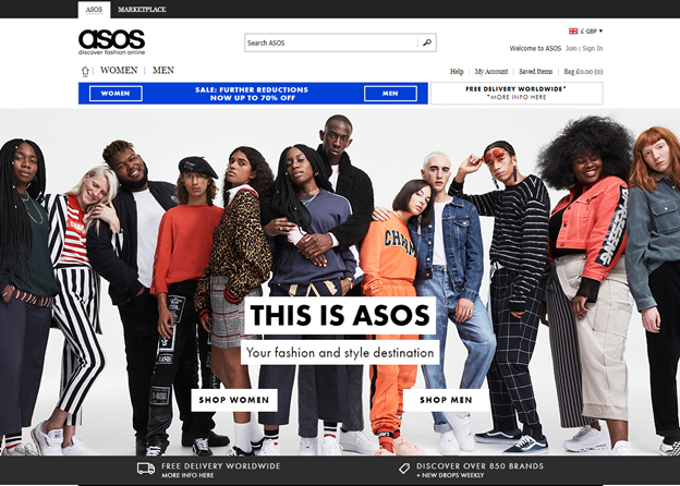
ASOS is an e-commerce website that deals mainly with clothing; this UK-based company sets a great example of how an ecommerce website should function.
Starting from the caption to the headline and sub-headline, it tells you what you should expect from this website.
And it also follows the CTAs very well.
Right under the headline and sub-headline, you could see a couple of buttons, “Shop Women” and “Shop Men,” which will redirect you to the respective pages.
And a perfect picture displaying what they are before you could even read what this website is about.
Netflix is another perfect example of no-nonsense home pages.
It let the images speak instead of text.
Even though the text is minimal, it certainly explains everything about what the website is all about and also a quick CTA button to guide you on how to get through the process quickly.
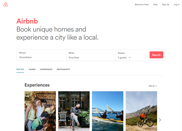
We have seen many travel websites, but nothing comes close to the simplicity and functionality of Airbnb.
It’s all a traveler needs, and it gives the best user experience.
The website presented the website in a way that’s optimized for a mobile view too. You see, most of the travelers must be in a remote place, and the internet could be a bit of a hassle. But Airbnb solves this by providing one of the fastest loading websites, even with high-quality images.
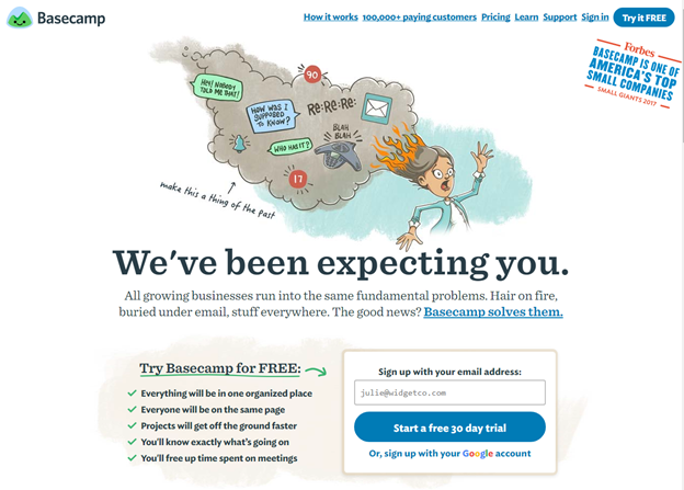
Basecamp is an excellent website for a company’s project management needs.
How does someone who comes across this website for the first time should know what they exactly are?
It’s the excellent use of the content on the homepage; the content is catchy and equally informative.
The services they provide are vast and to explain it is not an easy task. But they have pulled it off.
From the images to headlines, sub-headlines, and also CTAs are all correctly used.
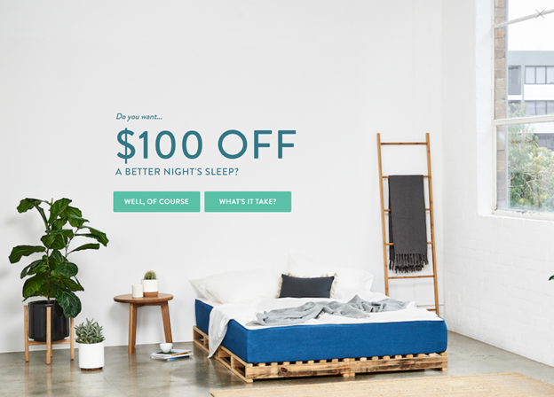
Koala is an Australian-based mattress company, and its website is a masterpiece.
Being a startup, they have pulled it off quite well and also made some great numbers, all thanks to their website.
This is how their home page looks, and the content on this website is a masterpiece.
It has witty and catchy content, which would make you click on everything on the website.
Do let us know your favorite design from these examples.
Conclusion
Making an effective homepage design is not just about looking good. You need to focus on answering questions like “Is it easy for the user to understand what you do,” “will the user choose you over others in the competition,” “how functional is your website.”
Most importantly, please do not confuse a customer, and always redirect the user to do next; never keep them guessing.
Create very clear CTAs which should keep the user engaged, and they should also complete your goals.
Also, use the right and valuable content, content as we have learned, is not just the text but also images and videos. Create interactive and witty descriptions and heading, making the user want to go further into other pages of your website.
Remember, it’s okay if you cannot achieve a perfect homepage, and even if you achieve, don’t just sit back and relax; you need to update it regularly.
If you are looking to refurbish your homepage design or make a new website, feel free to reach us. We will help you solve every query related to website homepage development.
Author’s Bio
Mohit Maheshwari is Chief Strategist at NMG Technologies, a full-service IT Company offering advanced world-class web development services. He has been in the industry since 2000 and focuses on long-term strategies, intuitive user experience and successful customer acquisition. Follow Mohit on Twitter and LinkedIn[/fusion_builder_column][/fusion_builder_row][/fusion_builder_container]


Comments